MoneyCoach Diaries is my ongoing journey to turn my indie app into a more sustainable part of my business. First time reading? See what happened until now by tapping this link.
Hello you, it is me Perjan, again. The last two weeks of March were insane.
Wanna know why? Here is what happened in the last 2 weeks.
Back to work
I am back at work after 2 days of rest at home. Well, rest is a word you can’t use if you have small toddlers running around the entire day. I wonder where do they get all this unstoppable energy if they are only eating bread & Philadelphia…
So I am back, alone, pumped on Ibuprofen. While our Michelangelo is in Rome doing as the romans do. And while I am alone (I shouldn’t be left alone), I opened our website, which was slow. On a 5G connection. That drove me crazy and I put our website for a scan on Google’s PageSpeed. 15/100 on mobile. Unacceptable.
We have a WordPress website and even though we have a fast hosting service, the theme is super slow. So I decided to use modern tech to completely redesign the page from the groundup.
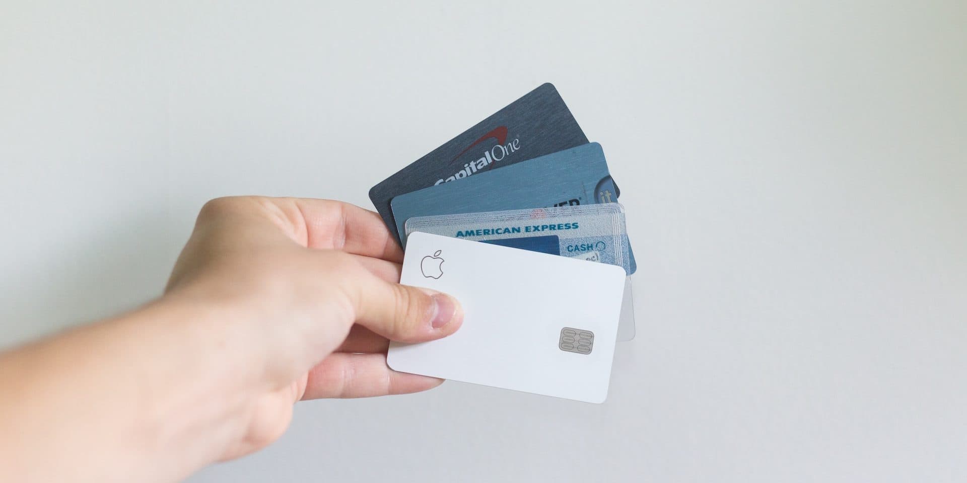
Credit Cards For Existing Accounts
When we started this feature, we thought to make it possible for new accounts. Then I asked our users on Facebook. They wanted it to work for their existing accounts as well.
The bad news for us. It took us longer to implement it. The good news for you. You edit the account type today and it will be backwards compatible. Meaning you will see all your previous billing cycles and statements.
The most important sections, the current billing cycle and the last billing cycle (the one you have to pay in full to avoid fees) took a lot of consideration.
First and foremost, how do you visualise your current expenses, while displaying the previous balance as well? Second, how do we make it easy for people to pay the outstanding balance? It took some iterations to get it right.
Billing cycles are hard
That is why you don’t see a lot of apps providing this functionality. They depend on the country, bank and even your contract conditions. Put in the mix February and you get an explosive result.
To model, calculate and visualize everything so that the user understands it, it is not a trivial task. We tested it a lot and it worked like a charm. More on this later.
MoneyCoach now offers a feature that makes it stand out.
It’s just filters, right?
Have I already mentioned filters? With the new release ans the inclusion of new account types, we had to redesign filters. Account filters are an important part of the app. We use them in reports, when selecting what accounts to consider for the overview. And then on top of it, to make things harder, you can select different accounts to calculate your net worth.
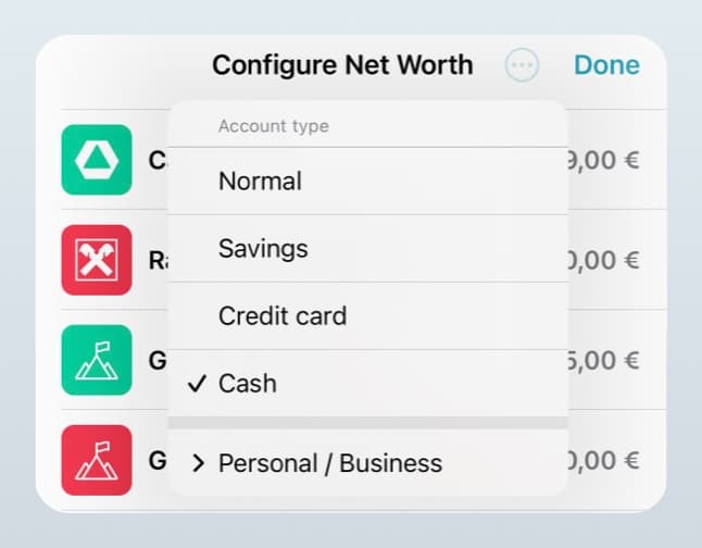
Currently I am developing the new account filtering and it is starting to look good. I fixed some bugs that Krist found out and now I am testing it in real life.
Take a look at the screenshot for example. Are you noticing some issues? Well, if you don’t live and breathe this everyday, you won’t. Here are some interesting details:
- Account type is capitalised. Looks weird now.
- Same for credit card.
- The major issue now is with the account usage selection. You don’t know if I selected personal or business or both?
- Now there is not a way to detect if the user selected manually an account that does not belong to the filtered account type. For example you filtered credit cards, but you want a cash account to be selected as well.
Let’s fix all of them.
Here is the fixed version.
![]()
I also added some icons, which now look weird. Taking a closer look at what Apple is doing, now I understand why they don’t look right. It turns out Apple uses the outline versions on menus. Here is another pass with shape only images. Way better, right? The small things…
![]()
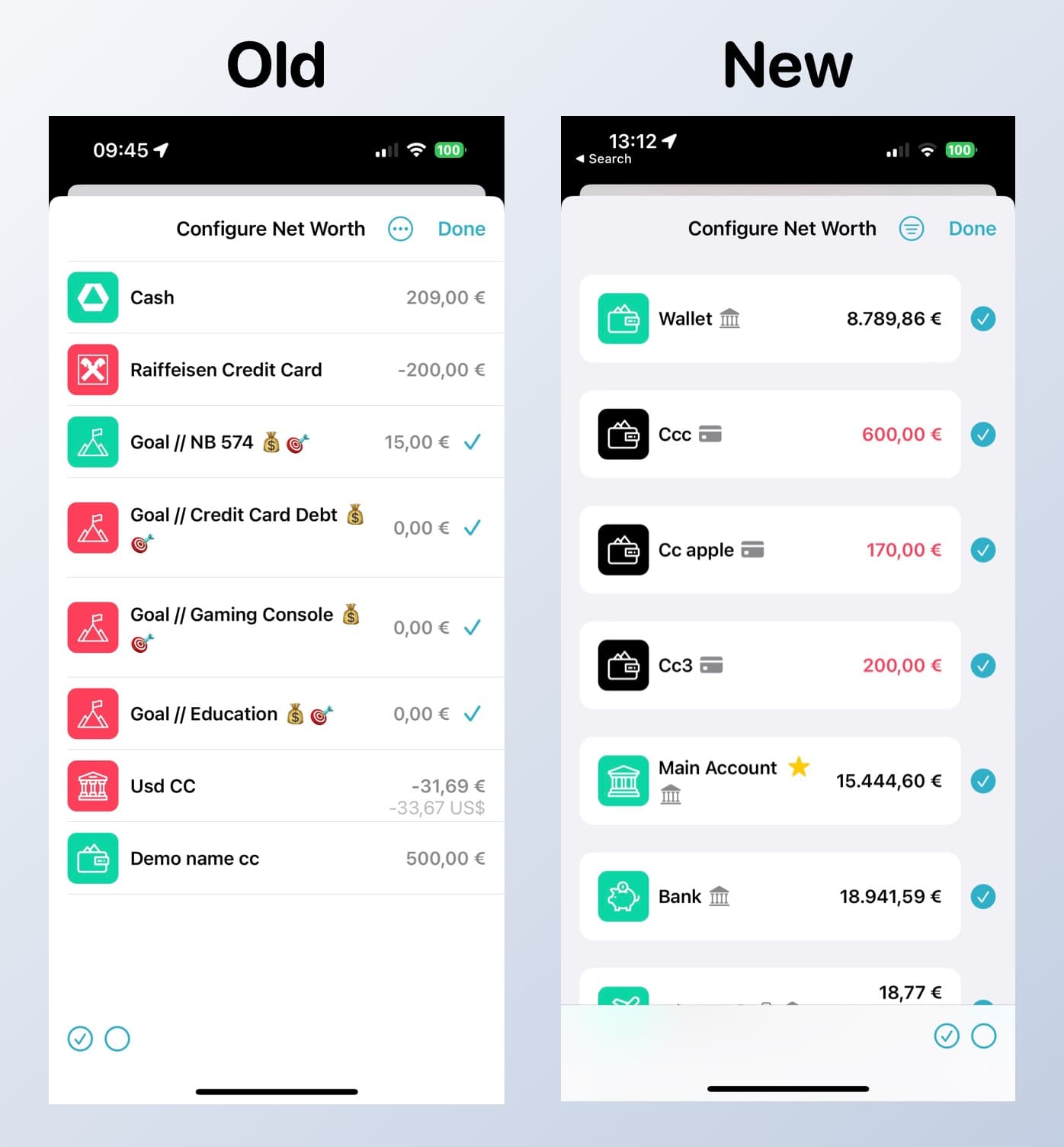
Which now brings me to my final part of this screen. The cell design. These cells have been designed since ages and they look a little bit out of place. They don’t feel right. Time to change them. And that skinny checkmark.  After only 2 hours of back and forth and fixing bugs in between, I came up with this.
Things nobody asked for
Have you spotted the changes in the account cells above? We got rid of emojis that defined the account type and its characteristics (business, savings) and added more unified symbols.
Testing Days
We sat down with Krist to do a big testing session of the new features and of the old ones. I think we spent the entire day testing out stuff on the iPhone, iPad and the Mac. After that I went on a bug fixing round and polished even more stuff.
One more thing…
Or should we call it bug. Or bugs. Krist discovered some bugs when synching with iCloud. The account type changed in a weird way. It was legacy untested code. I fixed it and we returned back to testing. All great. Tomorrow we will update the localisation and be ready to launch.
And a funny one. The plus button being recreated 100 times. Yikes. Easy bug, fixed in 15 mins.
Release Day. Yay. Or Nay…
As we approach the end of the month and the light at the end of the tunnel, you can’t imagine how tired I am feeling.
The more you approach your finish line, the further it seems. It drives you crazy. I hit the release button. Then we wait. The next day I get some crash notifications about an edge case we have not fully tested.
I fix it. Then a couple of hours later I find another issue I have to fix. I fix it as well, but the day had already ended and releasing before leaving the office is never a good idea. I learned it the hard way, trust me.
The next day, I upload a new version on the App Store, 8.4.1. Then we get some more bug reports for another edge case with complex and weird billing cycle calculations.
I got so depressed that day, I didn’t want to work at all. It breaks your heart to work for more than 6 weeks on a big release to then see it break for some users. You might say: "You should test more, or you should test the entire app before releasing or every time you introduce something, you break something…".
I heard it all and then some. And probably you are right. And you have the right to expect nothing but the best. So do I, from myself, from the product I deliver and from the products I use. Just please remember one thing. Most of the products or apps you use on a daily basis are made by big teams or large corporations that have massive manpower. We don’t. But we have a soul and we care.
I will leave it here for this edition of the newsletter, since it is already behind schedule and I wanted to release it so badly. But life happens in the meantime.
Talk to you soon.
Love,
Perjan


