MoneyCoach Diaries is my ongoing journey to turn my indie app into a more sustainable part of my business. First time reading? See what happened until now by tapping this link.
Hey dear reader,
I am writing the final updates of this diary entry waiting in the lobby of my oral surgeon.
I have to remove not 1, not 2, but 4 wisdom teeth 🦷🦷🦷🦷. Which at best would put me out of the development game for at least 1 week. Let’s see how I handle this. Wish me luck. (Or speedy recovery, since you will probably get this after everything is done).
Shitty Month Start
Not a good way to start the month.
I opened up the RevenueCat dashboard yesterday and I saw a massive drop in subscribers.
Update 1: Luckily for now the subscriber numbers are going again up. Let’s keep the momentum.
Update 2: We needed 14 days to get back to the same subscribers number. I am so looking forward to the new big release.
Existential Threat
If you read the news or are on Twitter you might have seen that SVB went bankrupt. It was a dark day for startups. Although we are not connected directly or have investors, it would probably affect us as well. How? We use a service called RevenueCat that handles the logic for in app purchases and subscriptions. They were facing an existential threat last week.\
Luckily for everyone so far, risk averted.
Back to business as usual.
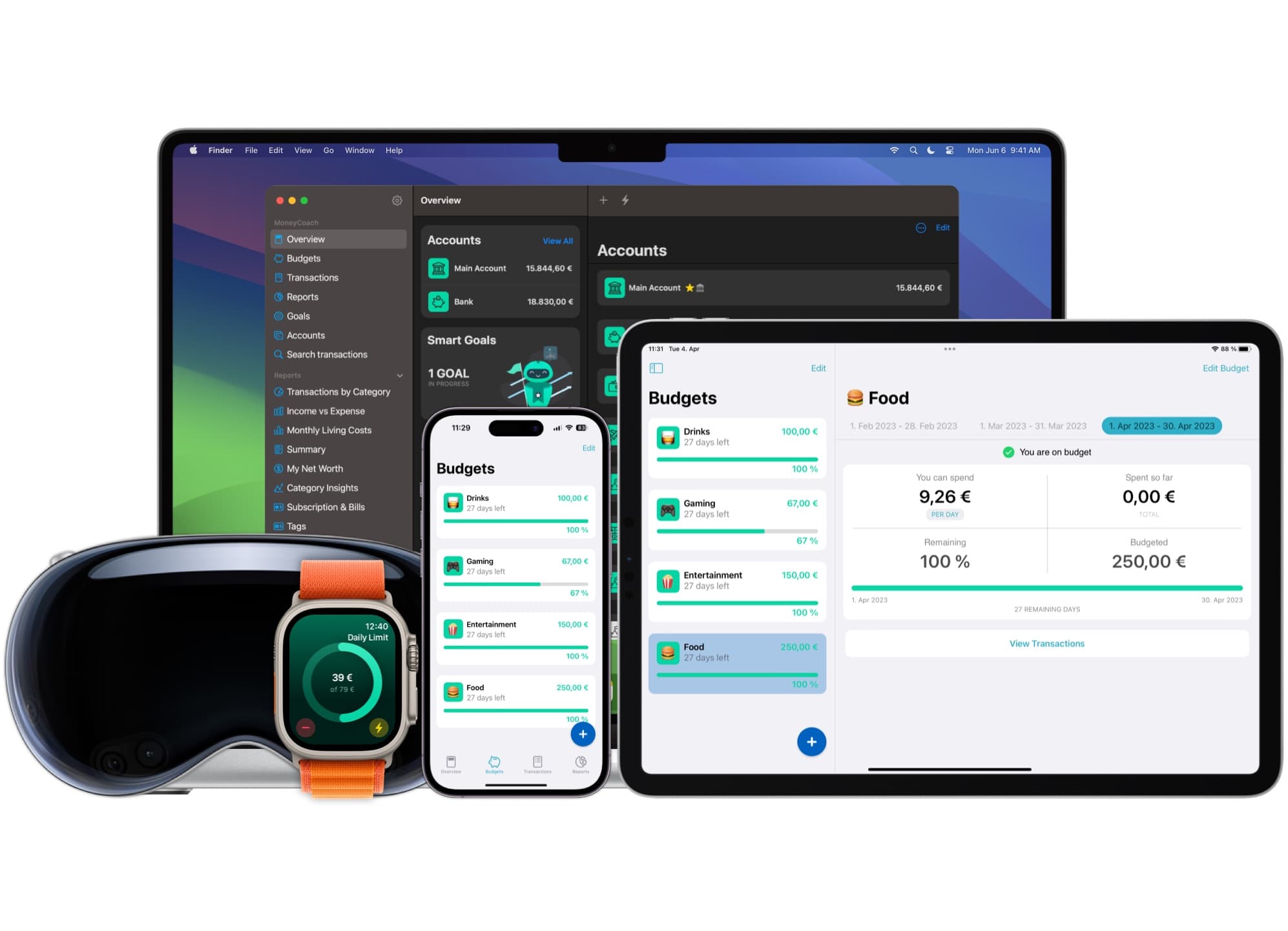
Colors. Colors. Colors.
Have I already told you about new colors coming to MoneyCoach?
When I started this feature, I started it to cool my head off from the credit cards feature. It is turning out to be a monster feature, sucking up a lot of development time.
Update 09.03.2023: As of today, we finally finished this massive feature on iOS and on macOS. Now the app will look more like you. If you want more cool colors let us know and we will evaluate them. Of course this will be available only to our subscribers, which we love deeply.
Why didn’t we put a color wheel?
We want the app to still look beautiful, regardless of the theme. And putting a color wheel where the user can select very very light or dark colors would make the app look like shit and the user wouldn’t use it anymore.
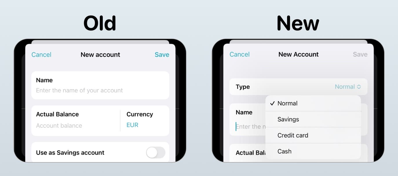
New Account Types
In order for MoneyCoach to support credit cards, a lot had to change under the hood. I used this occasion to include 2 new account types, normal and cash.
Design decisions
Now we have in total 4 different account types or 8 if you consider the ability to distinguish between business and personal accounts.
In the current UI, see below, we had switches and toggles. In the new UI, we got rid of the savings switch and made the screen react based on the account type you select.
Credit Cards
A lot of tiny design decisions went into this major feature. At best you won’t notice them at all, but if you do, let me know. I would love to hear from you.
Minus. Plus. No sign.
Credit cards are a different animal when it comes to account types. From visualizing them, to calculating billing cycles to configuring them. We sat down with Krist more than 20 times to discuss details, iterate and change the parts where it became too complex. I could go on and talk for hours about this, but I know you wouldn’t have the time to read this.
Take this for example. Showing the current balance. Everywhere in the app we display account balance with minus sign for negative and without sign if you have money on your account.
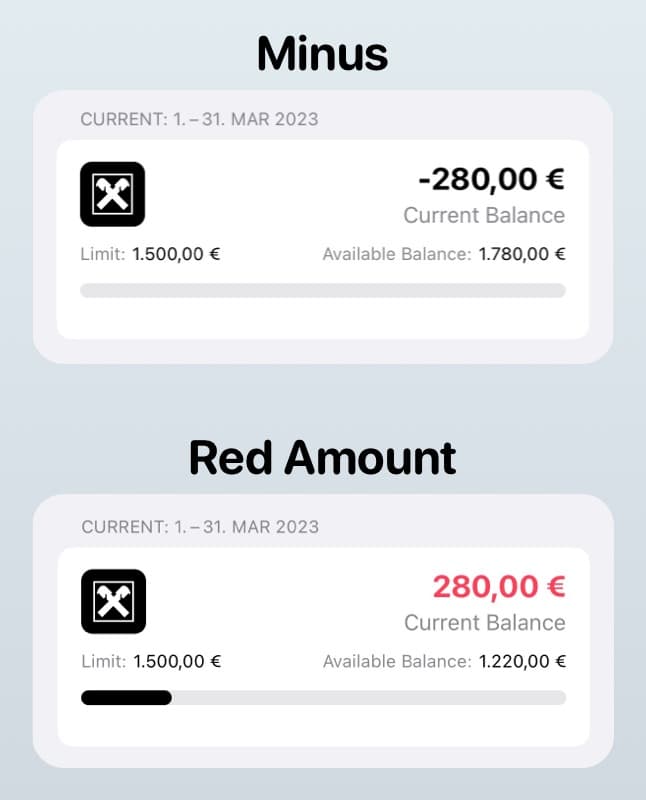
Things are different for credit cards. Account balance is displayed without sign in your credit card statement. And the account balance is really nothing more that the money you owe to the credit card company. Which means we can’t use the minus sign because it would feel weird. So we went for the red color to visualize debt and green to visualize more money deposited on your credit card.
New account types. New Filters
Having different account types requires a new way to visualize and handle account filtering. We use filters in the Net Worth, in nearly all reports and in the Overview.
The old design supported 3 different account types. The new one must support at least 4, for now. Which means there isn’t any space on the navigation bar. I also have to consider localizations, especially German, because words are at least 2x longer.
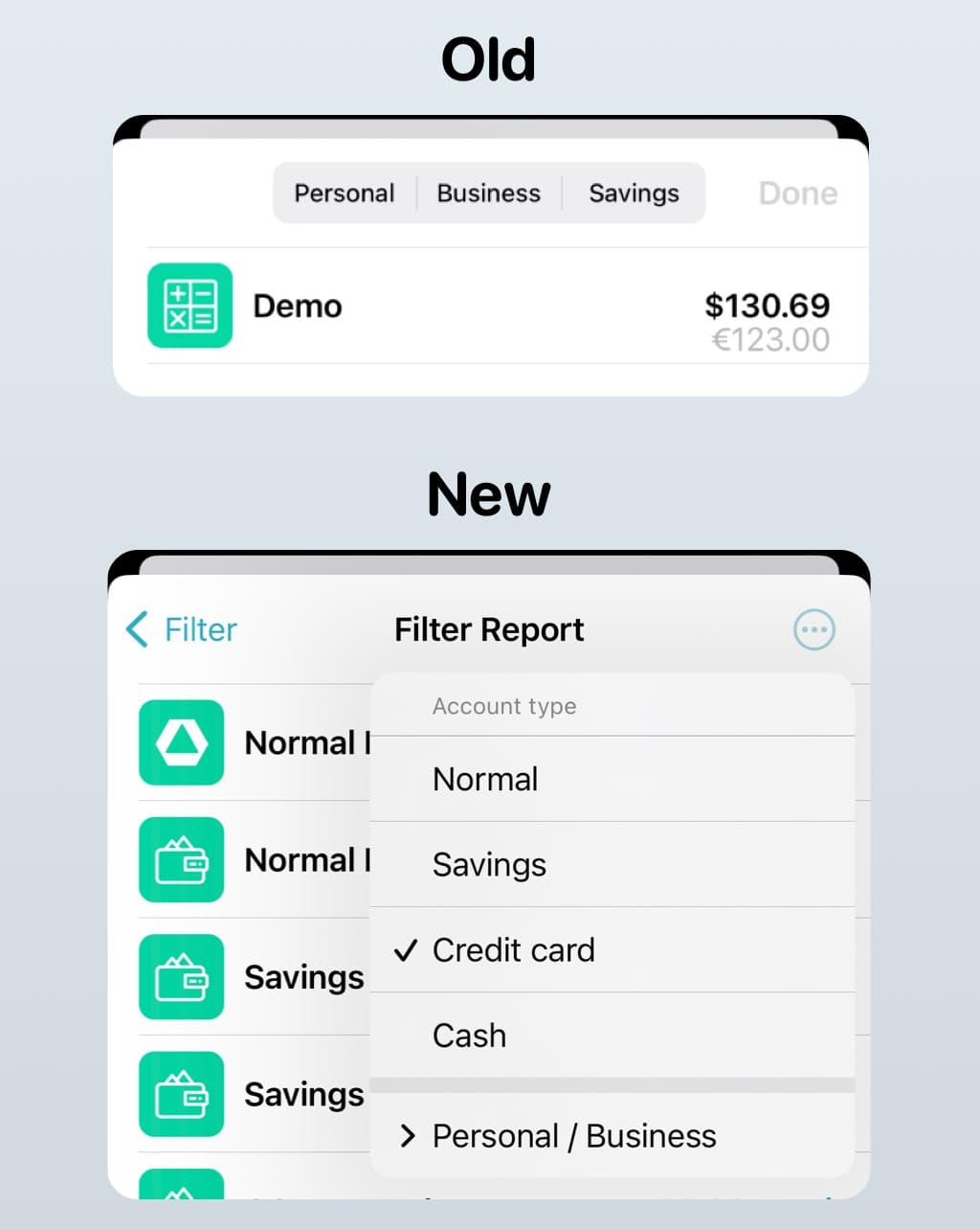
So we saw what Apple is doing and we went for a menu. Now everything looks cleaner.  If I have time, I will redesign the account cells as well. Let’s see.
That was it for the first part of March. As I am writing this part, I am waiting for the updates on my PS4 to complete (yes, I know, still PS4).
Ah and one more question. Should I post this updates on our Facebook group as well for other people to read? Yes, no, why?
Thanks for being part of the journey.
Cheers from a sunny Berlin,
Perjan