MoneyCoach Diaries is my ongoing journey to turn my indie app into a more sustainable part of my business. First time reading? See what happened until now by tapping this link.
Hello there, it’s your friendly neighbourhood spider man! Well, I mean your friendly neighbourhood MoneyCoach man :).
I hope you have been doing great over there. With everything happening around us and with the prices going bananas, I hope you enjoy this diary entry as much as I enjoyed writing it.
Cucumbers or Cocaine. What’s cheaper?
I went yesterday grocery shopping. Bought 5 cucumbers for 10 Euros. Crazy, right? But at least here in Germany we can still find them and enjoy these life delicacies. In the UK, cucumbers are considered an exotic endangered species now. What’s happening to the world? Insane. Let me know how is the situation in your country.
Credit Cards
It has been a while since we first saw this request in our forum. And since the first day we saw it, we wanted so bad to implement it. But then life got in the way and unexpected events started to occur, as they always do. (Here is a philosophical take. Maybe we should call them Expected Surprises.) And to tell you the truth, we really thought about it a lot. It was one of these nuts that are hard to crack. How to make it easy and accessible for everyone, while having a really useful feature.
Now we decided it is time to tackle it again and see if we can come out with a solution that will solve a real problem. That is, paying your credit card on time and paying off your credit card debt.
Which meant we first have to educate us about the complete credit card product flow. Now having and using a credit card is one thing. Thinking in analytical manner and really dissecting the user journey is another one. Krist went on to design some low fidelity mockups. I went on and draw some Picasso-style wireframes on my iPad Pro M2, which by the way draws kind of weirdly now. Have you seen your handwriting getting worse with the new iPad or latest iPadOS release? Please tell me you do. I don’t want to think my handwriting is becoming a doctor’s one…
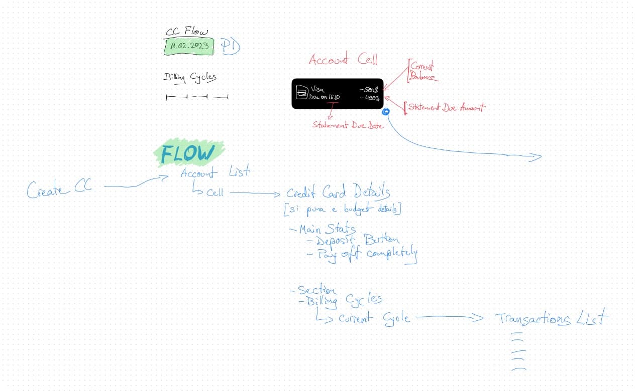
We started this feature officially on February 1st. Krist started to design and think about it more than I did. And he went down a rabbit hole, until I pulled him out. If you can see in the image above, you will recognise glimpses of what could have been, until we decided it was an overkill and maybe that wouldn’t help our users at all. In true startup fashion, we decided to step back, regroup and start with the core functionalities. Adding, editing and deleting a credit card account would be the essentials to get started.
The thing about integrating a new account type in a codebase that’s like 100 years old in dog years, poses certain issues and risks. Everything is connected and dependencies are everywhere. If you change something, there might be a case that something else might break. Now for the purists coders out there, I know the best practices and I know what I can do better now, but I didn’t at the time I wrote this piece of the app.
Which means refactoring and redesigning the account creation and editing part.
My initial idea was to inject only the new sections and keep the old logic. I spent 2 days on cleaning up the old code, make it modular (a.k.a Lego block-based style), added SwiftUI to UIKit interoperability and the results were ok.
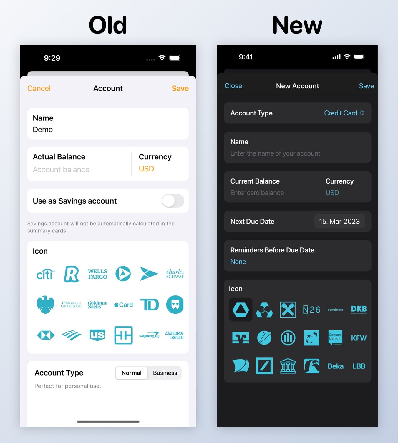
Then Krist came and threw me some little curveballs that hurt my product-led side. I had to do it, I had to implement the new account creation flow.
Update Feb 27th, 2023: Account creation nearly done. I added haptic feedback in the icon selection and added a new way for users to select an account type that is scalable for the future. Still no credit card implementation, though.
Oh, I could write for hours about everything that happened this month, but I have a meeting with Krist now and I have to go. We have to decide about our marketing efforts and tasks for this week. (This week is marketing week).
Update 1: We ran in circles, questioning everything and then some. Saw the subscriber numbers which are up, churn is down. This is great. The not so great part is that revenue is down. We will focus on that later on. For now improving the product has priority.
Things Nobody Asked For
As I was working on the credit cards feature, I kinda felt tired. And the best way for me to wind down, is to start working on something else. I know, it’s not the best way, but working on cool stuff gets me excited and pushes me forward. I wanted since always to give users the ability to personalise the app to their needs.
Which is why we are bringing colours in MoneyCoach. Now, if this was a new app, written yesterday in SwiftUI, this would be a joke of an effort. Since this is 100 years old in dog years, there are different technologies involved here that need to play nicely with each other.
Objective C, Swift, Storyboards, Nib-files, SwiftUI, you name it, we have it. Which meant I had to open every UI file and every other class files to see what is used where. This is only one part of the equation.
Then Michelangelo came in and threw a wrench in my wheels. If we had the same colour for buttons, menus and for the main plus button, then it would look confusing. He’s right. Back to changing stuff. Now the plus button has a colour of its own.
And then we need a place to configure everything. Which meant we needed a new screen in the settings. Krist did that as well. Now I have to connect it and to implement the logic. The plan is to release it in the major version 8.4.
Daily/weekly things that I hate
Having to develop a product is only one side of the medal. The other interesting side is building and growing a business. And in this side of the medal, there is one of my most hated activities. Bureaucracy and pushing paper. Well someone has to do it and that is me. FML. I would love to keep developing and exploring how we can bring credit cards to MoneyCoach.
Update 1: As I was scrolling through my Twitter feed, I saw someone tweeting about the bank that where we have MoneyCoach’s company account. It will shut down. This year. Which means I have to move everything into another place. Luckily for us, we already found the replacement. It is called Wise (formerly TransferWise). Great company, amazing product. I recommend it to everyone. Which reminds me that I have to change banking settings in our Apple developer account.
A Dark Day For MoneySpaces
Yesterday I went on to test MoneySpaces again personally, after a user complained about the sharing feature. For you who don’t know, MoneySpaces is MoneyCoach’s little brother. MoneySpaces is focused on, well, spaces for money. And the major feature is seamless and private sharing. Just like you share notes in your Notes app.
So sharing is pretty much everything in this app. As it turned out it didn’t work. Again.
Day 1
I spent nearly the entire day together with Krist testing to no success. After researching online, it turned out again that the issue was with a new API in CloudKit that didn’t work flawlessly since September 2022. Now it broke completely. We thought about workarounds, tested other techniques you read on StackOverflow and Apple Forums. Still nothing. Exhausted, I went home, being sure that this would be a sleepless night.
Day 2
I slept on the couch that night, not resting very properly. In fact I woke up at 05 AM and filed a support ticket (Radar) at Apple, explaining the issue and what was happening.
I even created a support ticket at Developer Technical Support. For those of you who don’t know what that is, think about it like this. You as a developer have 2 tickets/year to ask God for help. And God comes and looks at your issue and helps you solve that. Well, not this time. They replied saying that this is a known bug. People are working on it. Oh F%#@.
As the rest of my city woke up, I couldn’t help but think the inevitable. Got to the office. Called Krist. We had to face a difficult situation. Either remove MoneySpaces from the App Store or find another solution. I was up for removing it completely, because the app wasn’t doing its core feature. Then Krist came up with this temporary idea. What if we could save the app in the store, but strip everything that is related to sharing? This meant still having a live app and providing support for our current users. I liked the idea. That meant work had to be done. Unexpected work.
Brewed a coffee. AirPods Max on. Beast Mode on. Between implementing changes, testing back and forth and preparing the app for the App Store (Mac and iOS), we spent 4 hours each that day. Later that day Apple reviewed and released the app.
48 hours in. An emotional rollercoaster 🎢😢.
It sucks to be us right now.
That was it for this month folks. A lot of work, lots of improvements. Hopefully you will see them in your app in March.
Thanks for taking the time to read this.
It means a lot.
Perjan
